Homepage Personalisation: What Actually Works

Article Highlight:
- Personalisation only works when it’s meaningful, not just visible – most homepage experiences fail because they prioritise novelty over relevance, showing that smarter curation beats flashy AI-driven changes every time.
- The biggest gains come from simple use cases – such as tailoring products by location, behaviour, or lifecycle stage, rather than over-engineering complex one-to-one experiences that are difficult to scale.
- Homepage personalisation is an operational challenge, not just a technology one – success depends on clean data, aligned teams, and clear merchandising rules as much as it does on algorithms.
- Blending human merchandising with automation delivers the best results – retailers that combine strategic control with dynamic recommendations outperform those relying purely on either manual curation or AI alone.
- Measurement is often the missing piece – leading retailers treat personalisation as a continuous test-and-learn program, focusing on incremental uplift in conversion, engagement, and revenue rather than chasing perfection.
Homepage personalisation is one of those topics that sounds simple (“show the right things to the right people”) but turns into complexity the moment you try to operationalise it. Many retailers invest in tools, build segments, and deploy recommendation widgets — only to find the homepage still feels generic, results are inconsistent, and the organisation ends up arguing about “creative” versus “data”.
This article is a practical explainer for time-pressed retail leaders who want to understand what works, what doesn’t, and why. It focuses on ecommerce and omnichannel retail tech, but the principles apply equally to content-heavy brand sites and digital-first service businesses.
The core idea is straightforward: homepage personalisation works when it reduces customer effort, respects customer trust, and stays anchored to retail fundamentals (availability, value, and clarity). It fails when it tries to be cleverer than the shopper, or when it breaks the basics (speed, navigation, and relevance).
What homepage personalisation is and isn’t
Definition. Homepage personalisation is the practice of dynamically adapting homepage content, merchandising, and messaging based on what you know (or can reasonably infer) about the visitor. That knowledge might be explicit (they’re logged in; they’ve chosen preferences), inferred (they’re browsing a category; they’ve visited before), or contextual (their location, device, time of day, or local weather).
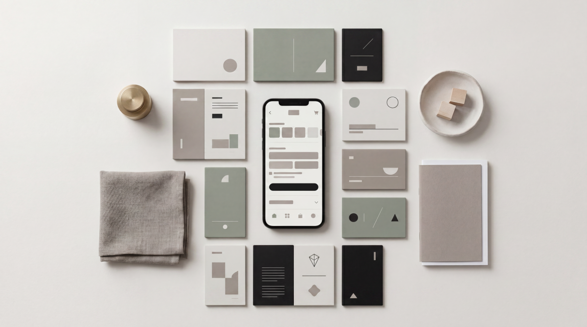
In practice, a personalised homepage is rarely “fully personalised”. It is usually a standard template with selected modules that swap content, reorder, or change emphasis based on rules and/or machine learning.
What it is not. Homepage personalisation is not:
A replacement for good navigation and site search. If customers can’t easily orient themselves, no amount of tailored tiles will compensate.
A substitute for merchandising discipline. Personalisation should amplify good merchandising choices, not automate them away.
A licence to remove options. “Personalised” does not mean hiding categories or making the site harder to explore. Retailers win when they reduce effort while keeping discovery intact.
A single feature. Treating personalisation as “add a recommendations carousel” is the fastest route to underwhelming results.
A useful way to think about it is a layered model, where the bottom layers (clarity, speed, trust) must be solid before you add higher layers (tailored modules and individual recommendations).
The most reliable gains typically come from Layers 2–4: contextual and intent-based tailoring that helps a wide share of visitors — not just logged-in customers.
Why the homepage is different from other personalisation
Retail leaders often ask: “Why does personalisation ‘work’ in email or ads, but not on the homepage?” The answer is that the homepage is a multi-purpose environment. It has to serve brand, navigation, promotions, and discovery — all at once — for visitors arriving with different levels of intent.
The homepage is also a high-visibility political surface inside a retail organisation. Trading teams want promotion frontage. Brand teams want storytelling. Ecommerce teams want conversion. Store operations want “click & collect” prominence. The result is often a crowded, slow, compromise page.
This matters because personalisation tends to introduce two kinds of risk:
Experience risk: content becomes jumpy, inconsistent, or confusing. Shoppers can’t “learn” the site because it changes too much.
Measurement risk: you see movement in click-through rates or engagement, but you can’t prove incremental value (or you cannibalise category browsing, email revenue, or paid traffic performance without realising).
The winning approach treats the homepage less like a single campaign canvas and more like a smart routing layer: it guides customers to the most relevant next step with minimal friction, while keeping the experience dependable.
What actually works and why it works
Effective homepage personalisation tends to follow a small set of repeatable patterns. The details differ by category (grocery vs beauty vs consumer electronics), but the logic stays consistent: use the homepage to answer the shopper’s unspoken question, “What should I do next?”
Pattern: Reduce “restart” behaviour for returning visitors.
Returning visitors frequently come back to continue something: a category they were browsing, an item they considered, a replenishment purchase, or a seasonal need they’re not ready to commit to yet.
What works here is “resume” design — and it is surprisingly underused:
A “Continue browsing” module that reflects the last category explored (not just the last product clicked).
Recently viewed items with clear pricing and availability.
Saved lists, wish lists, and “back in stock” prompts.
Reorder or replenish prompts (especially for health, beauty, grocery, pet, and household).
Why it works: it reduces cognitive load. The shopper doesn’t have to reconstruct their earlier intent. It also tends to be low-risk because it reflects the customer’s own behaviour rather than guessing who they are.
Pattern: Detect intent early for anonymous shoppers.
A large share of homepage traffic is anonymous — particularly on desktop, incognito, or first visits. This is where many retailers wrongly assume personalisation is impossible. In reality, intent signals appear quickly and can be used safely:
Entry context: Did they arrive from a brand search, a campaign, or direct?
First clicks: are they going to “New arrivals”, “Sale”, “Men”, “Skincare”, “Laptop deals”?
On-site search: even a single query (“linen shirt”, “running shoes”, “vegan leather bag”) is a strong indicator.
What works is a homepage that can shift emphasis based on early signals without becoming unstable. For example, the page can keep the same layout while swapping one or two modules:
If the visitor clicks “Sale”, bring forward clearance categories, price filters, and deal-led collections.
If they click “New arrivals”, bring forward trend edits, seasonal capsules, and full-price hero ranges.
If they click a sustainability hub or filters like “organic”, “recycled”, or “ethical”, bring forward sustainable fashion collections and transparency content (materials, certifications, repair programs) — but keep it factual and consistent.
Why it works: it respects that “personalisation” is often about session intent, not identity.
Pattern: Personalise within real-world constraints (availability, delivery, store).
One of the most commercially valuable (and sometimes overlooked) forms of homepage personalisation is constraint-aware merchandising:
Show delivery promises that match the visitor’s location (and your actual capacity).
Promote “click & collect” or “pick up today” only where store inventory supports it.
Prefer products with strong availability in the visitor’s likely fulfilment path.
This pattern is especially important in omnichannel retail tech setups, where digital and physical inventory, store operating hours, and fulfilment capacity vary by region.
Why it works: it prevents disappointment. A personalised homepage that sends customers into dead ends (out-of-stock, wrong store, misleading delivery time) destroys trust and drives up service load.
Pattern: Make promotions feel earned, not sprayed.
Discounting is a sensitive lever. Many retailers default to blunt tactics: “show everyone 20% off” or “show discount pop-ups to all new visitors”. Personalisation can improve this, but only with guardrails.
What tends to work better is benefit-based tailoring rather than universal discounting:
For price-sensitive segments, emphasise value (bundles, clearance categories, multi-buy offers) instead of automatically giving margin away.
For loyalty members, emphasise member benefits (early access, points multipliers, personalised rewards).
For full-price customers, lead with newness, quality, and editorial confidence — not sale banners.
Why it works: it aligns commercial outcomes with customer expectations. It also avoids teaching customers to wait for discounts.
Pattern: Keep discovery alive to avoid “filter bubble” retailing.
Personalisation can accidentally narrow the store. If you only show what a customer already likes, you reduce cross-sell and increase fatigue. This shows up as “the homepage feels repetitive” or “customers stop exploring”.
A better pattern is a deliberate balance:
A “Because you browsed” module for relevance.
A “Trending now” or “Best sellers” module for social proof.
A “New arrivals” or “Editor’s picks” module for discovery and brand-building.
This mix creates a healthier ecosystem: relevance without monotony.
Why it works: it preserves the dual role of the homepage: efficiency for goal-driven shoppers and inspiration for explorers.
Pattern: Personalise the call-to-action, not just the product tiles.
Many teams focus personalisation energy on product recommendations, but neglect calls-to-action. Yet CTAs are often the fastest way to reduce effort:
If the visitor is near a store: highlight store locator, store services, and click & collect.
If they are on mobile: highlight app benefits, barcode features, or mobile-only conveniences.
If they are already a loyalty member: highlight points balance, member exclusives, and personalised rewards.
If they are post-purchase: surface support pathways, returns, order tracking, and care instructions.
This is where omnichannel retail tech integration matters. Customer and transaction data from loyalty systems, CRM, and even mobile POS can enable lifecycle-aware CTAs — without turning the homepage into a “creepy” surveillance experience.
Why it works: it makes the homepage feel useful even when a customer isn’t in the mood to browse.
Pattern: Build personalisation out of modules you can test independently.
The operational trick that separates high-performing retailers is modularity. Instead of attempting to personalise “the homepage”, they personalise:
One module at a time.
One audience rule at a time.
One hypothesis at a time.
This makes measurement easier, operational load lower, and quality higher. It also prevents the common failure mode where teams can’t tell which part of personalisation caused a result — or whether the outcome was caused by seasonality, promotion, or the algorithm.
Why it works: it turns personalisation from a philosophical program into a manageable optimisation discipline.
What usually fails and how to avoid it
If personalisation is so valuable, why do so many personalised homepages disappoint? In most cases, it’s not because the idea is wrong — it’s because implementation violates basics of usability, trust, or measurement.
Failure mode: Personalising the hero carousel and assuming the job is done.
Homepage carousels are popular because they feel like flexible real estate. But they often fail in execution: they rotate too fast, are hard to control on mobile, hide critical content, and increase page weight.
If you personalise a carousel on top of those usability issues, you magnify the downside — customers miss the message and the page gets slower.
Avoidance strategy: if you use a carousel, treat it as a serious product with usability requirements and performance budgets. In many cases, a static hero plus a modular strip of personalised modules is simpler and performs just as well.
Failure mode: Trading speed for relevance.
Personalisation can add tags, scripts, API calls, and heavier images. The result is often slower load time — especially on mobile — and that can wipe out any conversion gains from better relevance.
Avoidance strategy: make page speed and stability non-negotiable guardrails. Prioritise server-side rendering where possible, keep modules lightweight, and avoid stacking multiple personalisation technologies that duplicate effort.
Failure mode: Over-personalising before earning trust.
The “creepy” line is real. When customers feel you know too much, the experience shifts from helpful to invasive. They may reduce engagement, refuse consent, or abandon.
This is the personalisation–privacy paradox in action: customers like convenience and relevance, but dislike feeling exploited for data.
Avoidance strategy: prioritise transparent value exchange. Give customers control (preference centres, clear consent flows, easy opt-out) and use personalisation that feels grounded in what they just did — not what you inferred from opaque sources.
Failure mode: Treating personalisation as a marketing-only feature.
When personalisation is run solely by marketing, it often becomes campaign-led and short-term. The homepage gets stuffed with offers and content swaps, while data quality, inventory constraints, and customer service impacts are ignored.
Avoidance strategy: treat homepage personalisation as a cross-functional capability: ecommerce trading, UX, data/analytics, engineering, and customer care. The homepage is where the organisation’s truth shows up — including where it is inconsistent.
Failure mode: Measuring clicks instead of business impact.
Clicks are tempting because they move quickly. But homepage personalisation can increase click-through while decreasing downstream conversion, average order value, or profitability. It can also cannibalise other channels (email, paid search) in ways that are invisible if you only look at homepage engagement.
Avoidance strategy: define a small set of business metrics (incremental revenue, conversion rate, margin, repeat purchase) plus guardrails (bounce, load time, returns, customer effort signals). Then use controlled tests with holdouts so you can see what is truly incremental.
Failure mode: Confusing personalisation with “more content”.
Many retailers respond to personalisation by adding more tiles, more modules, more messages — which increases complexity. The homepage becomes a dense catalogue rather than a decision tool.
Avoidance strategy: personalisation should simplify choices, not multiply them. If you add a module, you should be willing to remove or demote another.
How to implement and measure homepage personalisation responsibly
Personalised homepages become reliable when you treat them like a product: clear goals, clear measurement, clear ownership, and a repeatable operating rhythm.
Start with a decision model, not a tool.
Before buying or expanding technology, align on three questions:
What decisions should the homepage help the shopper make in the first 10 seconds?
Which audiences have meaningfully different needs (not just different demographics)?
What signals do we trust enough to adapt the page?
This reframes personalisation as decision support. It also prevents “solution shopping” — buying tools in search of a strategy.
Pick “low-regret” use cases first.
Early use cases should be:
Helpful even when wrong (e.g., “popular categories” vs “you definitely want this item”).
Easy to explain to customers.
Low operational overhead (you can run them weekly, not quarterly).
Examples include recently viewed, continue browsing, location-aware delivery messaging, and category emphasis based on first click.
Use controlled testing and keep a holdout.
Personalisation is a causal question: “Did this change cause a business improvement?” That cannot be answered reliably with before/after comparisons alone, because retail is seasonal and promotions constantly change.
A practical testing approach includes:
A/B tests for specific modules (e.g., a personalised “continue browsing” strip vs a generic best-sellers strip).
Holdout groups for “always-on” personalisation, so you can measure baseline performance and avoid over-crediting the algorithm.
Guardrails that stop tests if performance, bounce rate, or customer complaints spike.
Build privacy and consent into the design, not as an afterthought.
For Australian retailers, privacy expectations are rising and rules around direct marketing and data use require clear opt-out pathways and responsible handling. Even when your intent is “better experiences”, customers will judge you by transparency and control.
A few practical design moves reduce risk while improving outcomes:
Use first-party data (what customers do on your site/app) more than third-party data (what you buy from elsewhere).
Explain the value exchange in plain language (“Tell us what you like so we can show more relevant products”).
Offer a preference centre that feels like a feature, not a compliance form.
Make it easy to turn off personalised marketing, while keeping the core site usable.
Design the content supply chain for modularity.
Personalisation tends to fail operationally when content creation is slow. If it takes two weeks to create “personalised content”, you’re not personalising — you’re batching.
A modern approach is building a library of modular assets:
Hero: 2–3 options that can be swapped based on context.
Category tiles: reusable but reorderable.
Messaging blocks: delivery promise, loyalty benefit, sustainability commitments (for example, sustainable fashion messaging) that can be shown where relevant.
Product collections: curated sets that can be selected by rules (location, season, price band) without rebuilding the page.
Generative AI can help scale asset variations, but most organisations still need human oversight for accuracy, brand fit, and safety.
Treat search, navigation, and recommendations as one system.
Homepage personalisation works best when it is aligned with:
On-site search (personalised ranking and relevant suggestions).
Category merchandising (consistent availability, pricing, and promotions).
CRM and loyalty (consistent benefits, not conflicting offers).
Mobile app experience (especially if you are investing in mobile POS and app-led customer journeys).
This is where omnichannel retail tech maturity matters. A personalised homepage that conflicts with store pricing, loyalty rewards, or fulfilment reality erodes trust.
A lightweight operating cadence that works.
You don’t need a giant program office to start. But you do need rhythm:
Weekly: monitor guardrails (speed, bounce, conversion), rotate learnings, fix broken experiences.
Fortnightly: run 1–2 controlled tests on a single module or audience.
Monthly: review incremental value, decide what to scale, and prune what isn’t working.
Quarterly: refresh strategy, align with trading calendar, and tune the audience model.
The payoff is compounding: each test improves your understanding of what customers actually respond to, rather than what internal teams prefer.
The goal is not to “finish” personalisation. The goal is to build a capability that continuously improves while protecting customer trust.
Key statistics
A global survey found that 80% of customers say the experience a company provides is as important as its products and services; the same survey found 62% of consumers have recently reassessed their priorities.
Across surveyed customers, 80% said customer experiences should be better given the data companies collect.
Across surveyed customers, 79% said they are increasingly protective of their personal data.
Across surveyed customers, 71% said they would be more likely to trust a company with their personal data if its use were clearly explained.
Across surveyed customers, 44% said they are comfortable with brands collecting first-party data, while 30% said they are comfortable with brands collecting third-party data.
Research has found that homepage carousels are common (present on 33% of ecommerce sites), and many have usability performance issues (46% of ecommerce homepage carousels).
Industry research has found personalisation most often delivers 10–15% revenue lift (with results varying by sector and execution).
Personalisation leaders have been found to drive 5–15% increases in revenue and 10–30% increases in marketing spend efficiency, often through product recommendations and triggered communications.
Retail and ecommerce research has reported that 67% of brands consider personalisation a top priority with plans to invest further, yet four in 10 brands lack clear KPIs to assess personalisation efforts.
Mobile performance research has found that as mobile page load time goes from 1 second to 10 seconds, the probability of a visitor bouncing increases 123%; in the same research, increasing page elements from 400 to 6,000 was associated with a 95% drop in conversion probability.
Recent management research has argued that over the next five years, $2 trillion in revenue will shift to companies that create personalised experiences and communications.
Subscribe for cutting-edge AI updates
Get the latest thinking on AI-powered retail — from product personalisation to in-store innovation — delivered to your inbox once a month.